Brand guidelines
Brand is more than the colors that you’re using. It’s more than the logo. It is the symbolism, it is the combination, it is how your statements and your ethos are represented visually.
Ex humanitate fabulaeEx fabulis ars
01
The idea
The brand was designed to nod to transformations of the past, specifically in the art world.
Light
Tenebrism grew out of Renaissance painting into the Baroque, through Caravaggio.
It’s very dramatic. It calls very close attention to change and the contrast of dark and light.
Color
Creators are going to create, whether or not it’s by squishing plants and using their pigment to drawing on the side of a notebook during class.
Colors people trusted for centuries are proven colors.
The crow
There’s a reason that the crow looks majestic and like it’s flying up. And that’s because this is me reinventing and rebuilding what I think I was meant to do.
Why brand matters
A picture is worth a thousand words. It’s worth more than that. And a collection of pictures and a brand is how people interpret you.
When someone learns “that person works for Corbie,” it should be a good thing.
A living brand
The look can change with design standards and trends. The values don’t.
Humanity and art first. Not last.
The good times are not really what define you.
How you grow through the hard ones does.
The workshop
Apprentices were coached by masters, starting the outlines until they became masters themselves. Lifelong crafts vanish when no one carries them on.
Help the world have better graphics.
The motto
“From humanity, stories. From stories, art.” Two lines, always together, always in Latin. Humanitas also carries kindness and culture, so the first line means more than “people.” It isn’t a tagline: it sits above them all, and it’s used sparingly.
The companion line
Creare humanum est
“To create is human.” A sign-off, used on its own: never stacked under the motto as a third line.
02
Voice
Five traits, side by side.
Sharp, not corporate.
Short sentences. Say the thing.
Warm operator, not vendor.
Talks like the person who will actually do the work.
Clever, understated.
The crow wink lands once per piece.
Collaborative.
“We built this with your team,” not “I built this for you.”
People first, not bottom line first.
Corbie still has to make money: “Nobody can have those benefits if we don’t make money and we don’t get clients.” People just come first.
Don’t “We’ve optimized our model for margin.”
Do “Here’s what this costs, and here’s who it pays.”
Drafted with AI from Callie’s words.
Words
Say operator, network, vetted, diagnose, build the plan, stake
Avoid agency, vendor, gig, leverage, best-in-class, synergy
Style
Oxford comma. Sentence-case headings. Spell out numbers one through nine. No em dashes. “Corbie Creative” in full on first mention.
Two tests for every piece of copy
Does it read as unmistakably not an agency and not an MLM?
Would I be fine with a client digging it up later?
03
Color
The story of each pigment leads.
Sometimes I want to wear pink. Some days I want to wear black.
Ten core colors, 56 values. No color has a fixed job, Weld included. Two rules hold: use only the 56 palette values, and text contrast must pass.
Verdigris
Verdigris is the blue-green crust that copper grows as it weathers, and it has been scraped off and used as a pigment since antiquity. It is time doing visible work on metal, which makes it the color for the old half of old meets new.
Woad
Woad is a blue dye made from the leaves of a plant, and it dyed European cloth long before indigo arrived. It stands for trade and craft that moved across a continent.
Orchil
Orchil is a purple-red dye extracted from lichens. It is a humble, overlooked organism turned into something rich, which is a fair description of how I like to treat a messy brief.
Tyrian
Tyrian purple was made from sea snails and was so costly that it became tied to royalty. It marks the valuable, finished result.
Madder
Madder is a red dye from the roots of a plant. It is the color of labor and craft, the kind of red that comes from digging in.
Weld
Weld is a yellow dye from a common roadside plant.
Lincoln Green
Lincoln green was a cloth made by dyeing wool blue with woad and then yellow with weld, and it is tied to the outlaw woods of English legend. Two dyes made a third color.
Ochre
Ochre is a pigment from iron-rich earth, among the oldest colors people have used. It is the warm ground under everything else.
Vine Black to Gesso
04
Light and motion
One thing in the light. The story around it.
Every piece has one focal point: the message someone should remember if they remember nothing else. Everything else supports it.
Behind every finished piece is what you don’t see: the training, the 500 proofs, the iterations, the people in the background. The light shows the moment. The dark holds the work behind it.
The dark, dramatic look is our signature, not a requirement. The focus is the requirement.
Drafted with AI from Callie’s words.
Why it matters now
AI makes long documents cheap.
Having a lot of long documents used to be a proof of work.
Conference decks packed every chart and number “instead of telling this and weaving a story.”
The work behind the work
It’s the everything that goes into creating a masterpiece. It’s the 500 different proofs. It’s the iterations.
This is also why Cof exists.
05
Type
Bricolage Grotesque for headings, IBM Plex Sans for body. Variex OT and Major Mono Display are for the logo only.
The play happens inside them: spacing, color, hierarchy, and weight.
Ex fabulis ars
Corbie ex fabulis ars
Our handmade lettering, placed like artwork: the motto, the companion line, one key word or short phrase inside a line, and short lists in pen-line word boxes. Never a whole heading (the motto is the exception), and never body text.
- One thing in the light. The story around it.
- One thing in the light. The story around it.
- One thing in the light. The story around it.
- One thing in the light. The story around it.
- One thing in the light. The story around it.
06
Image and texture
Part of our entire ethos is finding beauty in the human touch.
Use textures and techniques from historical art: a linocut-stamp icon, an illustration with an oil-paint finish, and so on. Photographs are welcome too.
Avoid the “too perfect” look of much AI-produced artwork.
Art history and public-domain images carry the nod to the past, and every one is credited.
The pen line
Boxes and buttons are drawn by hand: four pen strokes around a paper fill, so nothing on the page looks ruled by a machine. Key words get a colored word box, tilted a little.
A human starts it. A human finishes it. AI can help in between, and we say where it did.
Drafted with AI from Callie’s words.
- No limit on AI tools. Responsible use gives people more time to create with their hands.
- A human makes the first push: the concept, the mockup. AI can help in the back-and-forth. A human finishes.
- Never “create something for Corbie without any direction and just create it and post it and go.”
- Writing: AI may check grammar, language, and repeats. “The initial pass and the initial writing and the finalizing should be done by a human.”
- Cof is where Corbie says where AI was used, and how it could have been used better.
07
The crow
Today, it’s me rising. Over time, it’s every creative who endures, reclaims, and reinvents, and every team that’s stronger for it.
The logo is never altered.
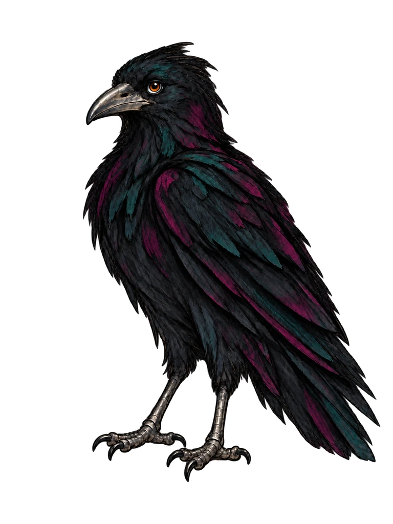
Aesop
The geometric crow is the logo. Aesop, the brush-ink crow in the corner of every page, is the character: the one who talks to you. He’s named after the storyteller, and the logo is never swapped for him.
Any core color, chosen by the work
The only rule: it stays visible and passes accessibility, at 3:1 or better against its background. These are examples, not the only options.
- Gesso on Vine Black
- Vine Black on Gesso
- Gesso on Verdigris
- Gesso on Orchil
- Weld on Vine Black
Madder fails on Vine Black (2.7:1). Use a lighter Madder step or another color on dark grounds.
Show it, don’t hand it out
No public download. Need the files? Ask us.
Drafted with AI from Callie’s words.
Usage
The Corbie name and crow are trademarks of Corbie Creative LLC. Please don’t use them without permission.
08
Using the brand
- Client work uses the client’s brand, not Corbie’s.
- Anything under the Corbie name (a pitch, a proposal, a document) follows Corbie’s standards.
- Anything made for Corbie itself follows Corbie’s standards.
- Members show they belong by wearing Corbie merch or using the Corbie Community identifier.
- Never use the logo inside, or build on it for, an individual’s own designs.
- Co-branding: no hierarchy requirement for Corbie. A written credit like “Part of Corbie Collective” can be set in the partner’s own fonts; only the logo must be exact.
09
The family
It all stays Corbie.
The family is open-ended: “Corbie [word],” for example Corbie Video or Corbie Web Design, including lines members may lead someday. A new sub-brand is a new identifier word, not a new logo.
- Corbie CreativeLive
- Corbie CofLive
- Corbie CommunityOpen for interest
- Corbie CollectiveOpen for interest
- Corbie Commerce (merch)Planned
- Corbie CultivatedPlanned
- Corbie Collection (members’ shared resource library)Planned
10
How the brand has changed
- 2026-10-23 “One thing in the light.”
- 2026-10-23 The Creed’s first pass.
- 2026-10-29 The motto, the companion line, and the Corbie lettering.
- 2026-11-05 The pen line across the site, and key words in the lettering.
 Next roomThe LoreHow Corbie came to be.